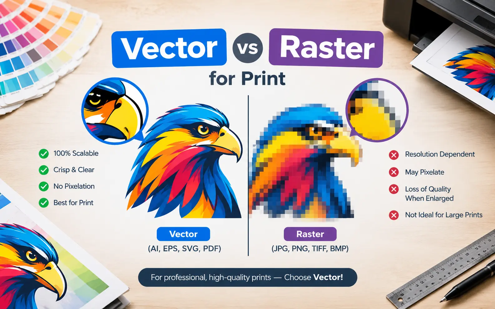
Most print problems we see start before the press ever runs. A logo that looked sharp on screen arrives fuzzy on a banner. A “vector” PDF turns out to be a screenshot in disguise.
This guide skips the textbook definitions and focuses on the decisions that actually change your result.
For vector vs raster for print, use vector for logos, text, line art and anything a machine has to cut or separate into spot colors. Use raster for photographs and soft gradients, at roughly 300 pixels per inch at the final printed size. Most real jobs need both, combined into one press-ready PDF.
The Pixel Math Nobody Shows You
Use 300 DPI is useless advice until you know how many pixels that means for your job. The calculation is simple: required pixels = print size in inches × target ppi.
A few examples:
- Business card: 3.5 × 2 inches needs about 1,050 × 600 pixels at 300 ppi.
- Phone photo: A typical 12-megapixel image (4,000 × 3,000 pixels) prints cleanly up to about 13.3 × 10 inches.
- Web logo: A 600-pixel-wide PNG tops out near 2 inches wide before it softens.
Resolution is always judged at the size you will print, not the size of the file on your screen. An image labeled 300 ppi that you stretch to double its size is effectively 150 ppi.
We also warn people about the “change DPI to 300” shortcut in Photoshop. Flipping the number without resampling changes nothing about the pixel count. You have to compare real pixel dimensions against the math above.
Viewing Distance Changes the Rules
Not every job needs 300 ppi. The human eye resolves detail at roughly 3,438 divided by the viewing distance in inches, which is a visual limit rather than a printer spec.
At 12 inches that is about 286 ppi, which is why handheld flyers and business cards need 300. At 36 inches it drops to about 95 ppi. At 10 feet it falls under 30.
This is why a 6-foot banner built from a 100 to 150 ppi photo can look fine from across a room. Ask your printer for their large-format minimum before you buy a bigger stock image.
The PDF Trap: A Vector File That Is Secretly Raster
A PDF is a container. It can hold true vector paths, embedded photos, or a single flattened picture of everything.
These are the usual ways vector artwork turns into pixels without anyone noticing:
- Screenshots: A logo captured from a website and dropped into a layout is raster, whatever the final file type says.
- Raster effects: Drop shadows, glows and blurs in Illustrator get rasterized at the document’s effects resolution. Check Effect > Document Raster Effects Settings and set it to High (300 ppi).
- Photoshop exports: A PDF saved from Photoshop is raster by default, even if you drew shapes there.
- Flattened transparency: Aggressive flattening presets can convert complex vector regions into pixel blocks.
To verify, zoom the PDF to 800% or more and look at the edges of text and logos. Crisp means vector. Jagged squares mean raster. Acrobat Pro’s Preflight tool can also list every embedded image with its effective resolution.
Your Printing Method Decides the File
The same artwork can need different files depending on how it reaches the substrate.
- Screen printing: Vector artwork separated into flat spot colors gives the cleanest edges. Photos need halftoning, which is a different workflow.
- DTF and digital transfers: Raster handles gradients and shadows well. Supply it at 300 ppi at final size with real transparency.
- Embroidery: Neither format stitches directly. A digitizer converts your art into a stitch file, and clean vector artwork speeds that up.
- Vinyl and die cutting: The cut contour must be a vector path. A raster outline cannot drive a blade.
- Offset and packaging: A PDF/X preset such as PDF/X-1a or PDF/X-4 is standard. Dielines should always be vector.
- Large format: Vector text and logos stay sharp at any size. Photos follow the viewing-distance rule above.
Vector Does Not Mean Print-Safe
A genuine vector file can still fail prepress. These are the issues that bounce files back:
- Hairline strokes: Very thin lines can vanish or print uneven. Many printers set a floor around 0.25 pt for positive lines and higher for reversed-out ones, so confirm with yours.
- Live fonts: Unoutlined text swaps to a fallback font on the printer’s system. Outline it or embed the fonts.
- Missing bleed: Extend backgrounds past the trim line, commonly 0.125 inch (3 mm), so cutting variance does not leave white slivers.
- Overprint settings: Stray overprint attributes can make colors mix or disappear on the plate.
- Wrong color space: RGB artwork shifts when converted to CMYK. Convert and proof it yourself rather than letting the RIP guess.
Spot Colors and Pantone Live in Vector
Brand colors are easiest to control on vector objects, where you can assign a named swatch like Pantone 7421 C. The printer then mixes that exact ink, or maps it to the closest CMYK build for digital work.
Photographs are almost always CMYK, so expect small shifts there. If a logo color must match across shirts, signs and packaging, keep it as a spot swatch on a vector shape. Never sample it from a photo of the logo.
How to Rescue a Low-Quality Logo File
Everyone eventually has a 200-pixel JPEG and a deadline. Here is the order we work through:
- Hunt the original. Ask the designer or agency for the .ai, .eps or vector PDF first. This solves it more often than people expect.
- Try Image Trace. In Illustrator, run it on a clean, high-contrast logo, then expand and inspect every curve.
- Check the damage. Trace tends to round sharp corners, merge thin gaps and wobble small text.
- Redraw if needed. For anything with fine lettering or precise geometry, rebuilding with the Pen tool beats cleaning up a bad trace.
- Retype the text. Identify the font, set it live, then outline it.
AI upscalers can enlarge a raster logo, but they invent detail. Treat the output as a reference for redrawing, not as final artwork.
Quick Chooser: Which File for Which Job
| Artwork element | Best format | Key spec |
|---|---|---|
| Logo or wordmark | Vector (.ai, .eps, vector PDF) | Outlined fonts, spot swatches |
| Product photo | Raster (.tif, .psd, high-quality .jpg) | 300 ppi at final size |
| Cut line or dieline | Vector path | Separate spot color layer |
| Soft shadow or gradient | Raster, or vector with raster effects set to 300 ppi | Check flattening |
| Large banner photo | Raster | 100 to 150 ppi at final size |
| Line art or signature | Vector, or 1-bit raster at 1,200 ppi | Avoid anti-aliased edges |
Final Hand-Off: What to Actually Send
Printers usually want a single flattened-where-needed PDF, with native files available if they ask. Include bleed, crop marks if requested, and all images embedded.
Run a quick preflight, then export using the preset your printer names. If they have not named one, ask. It takes thirty seconds and prevents a reprint.
Frequently Asked Questions
Is SVG a good format for print?
SVG is built for browsers. Many printers will not accept it directly, so export a PDF or EPS from the same artwork.Is EPS still acceptable?
Yes, most printers still accept it. PDF is generally preferred now because EPS cannot hold live transparency.Can I send a Canva design to a commercial printer?
Use the PDF Print export, which keeps text and shapes as vector. Photos inside the design remain raster, so check their resolution.Is Procreate artwork vector or raster?
Raster. Create the canvas at your final print size and 300 ppi from the start, because you cannot add real detail later.Should I send native files or a PDF?
Send a PDF unless the printer requests native files. Native files can break from missing fonts and links.Do vector files need to be CMYK?
For offset and most packaging, yes. Some digital and large-format shops accept RGB and convert it, so ask which they prefer.