
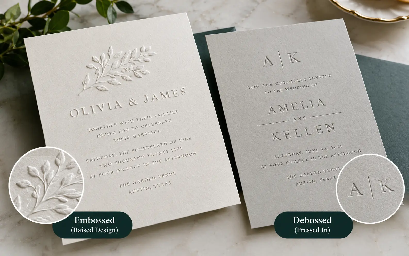
Embossed invitations have a design pressed up from the back, so the pattern sits raised above the paper. Debossed invitations have the design pressed down from the front, so it sits recessed into the paper. Both use the same metal dies and pressure, the only real difference is which side of the paper the pressure comes from, but that one choice changes how the card feels, photographs, ages, and even mails.
If you've been reading through comparison articles trying to pick one for your wedding suite, business cards, or packaging, you've probably noticed most of them stop at "raised vs. recessed" and call it a day. That's the easy 20% of the decision. The other 80%, the part that actually determines whether you're happy with the box that shows up at your door, is what happens after the die hits the paper. Let's get into that.
Why the Same Die Can Feel Completely Different Depending on the Paper
Here's something almost none of the competing guides mention: the die doesn't determine the final texture, the paper does.
A 100lb cardstock and a 220lb cotton stock can go through the exact same emboss die and come out feeling like two different products. Thin paper springs back partially after the press releases, so the relief looks shallow and can even crack along fold lines. Thick, high-cotton stock has more fiber to displace, so it holds the impression crisply and resists cracking.
This is why a $12 debossed invitation from a big-box printer can feel flimsy while a $9 one from a specialty letterpress studio feels substantial. It was never really about the technique. It was about whether the paper had enough body to hold it.
Practical rule of thumb I use when reviewing samples: anything under 250gsm (roughly 92lb text weight) is a gamble for a clean emboss or deboss. You want 280-350gsm cotton or cotton-blend stock if you want the detail to read as intentional rather than accidental.
Where Each Technique Actually Earns Its Keep
Most articles list "emboss = fancy raised look, deboss = subtle sunken look" and move on. Here's where that plays out in real projects.
Embossing works best when:
- The detail needs to read from across a table, like a monogram on a place card or a crest on a save-the-date
- You're pairing it with foil (foil stamping and embossing together, sometimes called "foil emboss," is one combination almost none of the competitor guides mention, and it's what gives that shiny raised metallic look you see on premium wedding suites)
- The design has rounded, organic shapes like florals or script, since raised relief catches curved light beautifully
Debossing works best when:
- You're combining it with letterpress ink, since the recessed area is exactly what holds pigment in true letterpress printing (this is the technical link between debossing and letterpress that a lot of guides gloss over: letterpress is a form of controlled debossing, just with ink added)
- The layout is minimalist and text-heavy, because a deboss reads quietly and doesn't compete with typography
- You want a design that survives handling better in transit, since a recessed detail is less exposed to being flattened than a raised one
What Happens After the Press: The Part Nobody Warns You About
This is the section that separates a genuinely useful guide from a rehashed definition post.
Mailing and postage
A heavily embossed invitation isn't flat anymore, it has a raised profile. If your emboss is deep and covers a large area, USPS and other postal carriers can flag the envelope as "nonmachinable" because of the uneven surface, which triggers an extra surcharge. This almost never comes up with debossing, since the surface stays flush. If you're mailing hundreds of formal invitations, ask your printer or post office to check the finished piece against current nonmachinable surcharge rules before you print the full run, not after.
Aging and storage
Paper has memory, but it's not permanent. Debossed detail can relax and soften over years, especially if the invitations are stored flat under weight (photo albums, stacked keepsake boxes). Embossed detail tends to hold its shape longer because the fibers were pushed outward rather than compressed inward, but it's more vulnerable to being crushed if something heavy sits on top of it in storage. If you're keeping the suite as a keepsake, store it upright or in an acid-free box with breathing room, not stacked flat under other paper goods.
Ink and addressing
If you plan to hand-address or print names directly over an embossed or debossed area, don't. Ink sits unevenly on a raised or recessed surface and tends to skip, feather, or pool. Keep monograms and decorative embossing away from the areas where names, addresses, or RSVP details need to go.
What You're Actually Paying For
Both techniques use a custom metal or magnesium die made from your artwork, and that die is usually a one-time setup cost of roughly $50 to $200 depending on complexity and size, separate from the per-unit printing cost. Here's the part that surprises people: the die cost is identical whether you choose embossing or debossing. The price difference you see between quotes almost always comes from paper stock, ink or foil add-ons, and order volume, not the technique itself.
| Cost factor | Embossing | Debossing |
|---|---|---|
| Die setup (one-time) | $50–$200 | $50–$200 (same die can often do both) |
| Best paper weight | 280–350gsm+ | 250–350gsm |
| Works well combined with | Foil stamping | Letterpress ink |
| Postage risk on thick runs | Higher (raised profile) | Lower (flush surface) |
| Typical per-card add-on cost | Slightly higher (more setup precision) | Slightly lower |
Small print runs (under 100 pieces) usually feel more expensive per card because the die setup cost gets divided across fewer units. If you're doing a large order, like corporate packaging or bulk event invitations, the per-unit cost drops fast once you clear a few hundred pieces.
Combining Emboss and Deboss on One Suite
A trick professional stationers use that rarely gets mentioned: you don't have to pick just one for an entire suite. A common approach is a debossed monogram on the outer envelope liner (subtle, doesn't interfere with addressing) paired with an embossed detail on the invitation itself (bold, catches light when the guest opens it). This layered approach gives the suite depth without making any single piece too busy.
The one combination to avoid: stacking emboss and deboss directly on top of each other in the same spot. The paper fibers get pulled in opposite directions and it usually cracks or looks muddy rather than crisp.
How to Spot Quality Before You Commit to a Full Order
Always ask for a physical proof, not a digital mockup, before approving a run. Here's what to check on the sample:
- Edges should be sharp, not fuzzy or rounded. Blurry edges usually mean the die pressure was too light or the paper was too thin for the detail size.
- Depth should be consistent across the whole design. Uneven depth on a monogram often means the press wasn't calibrated correctly.
- No cracking or whitening along the fold lines or edges of the impression, especially on darker or coated stock. Whitening happens when the paper fibers are stressed beyond what the stock can handle.
- Run your finger over the back of an embossed piece. You should feel a slight indentation on the reverse side. If the front looks raised but the back is completely flat, the paper may be coated or laminated in a way that will crack over time.
A Quick Decision Framework
If you're still torn, ask yourself these three questions in order:
- Does the design need to be visible from a few feet away (place cards, table numbers, packaging on a shelf)? Lean embossed.
- Is the design mostly typography or a minimalist layout? Lean debossed.
- Will this be mailed in bulk or handled frequently before the event (RSVP cards, save-the-dates)? Lean debossed for durability and postage simplicity.
There's no wrong answer here. Plenty of luxury wedding suites use debossed monograms and plenty use embossed crests. The technique should match the paper, the layout, and how the piece will actually be used, not just a general idea of "which one looks fancier."
Frequently Asked Questions
Can you emboss or deboss on colored or dark paper?
Yes, but the effect is more subtle since there's no ink or foil contrast, only the light hitting the relief. Dark, uncoated cotton stock tends to show the shadow of a deboss more clearly than glossy dark paper.Does embossing or debossing work on digitally printed invitations?
Yes. Embossing and debossing are separate finishing passes done after the base printing, whether that printing is digital, offset, or letterpress. The card gets printed first, then run through the die press.Which technique is better for someone with visual impairments who wants a tactile invitation?
Embossing is generally easier to feel by touch since the raised surface is more pronounced under a fingertip than a recessed one, though depth and paper stiffness matter more than the technique itself.Can I emboss or deboss at home without a professional die?
Small-scale versions exist for crafters, like embossing folders used with a manual die-cut machine or heat-embossing powder for stamped designs. These work for cardmaking but don't produce the crisp, deep result of a professional metal die press, so they're not a substitute for a full invitation order.Will embossing or debossing make my invitations more expensive to ship internationally?
Possibly. Thicker, heavily textured cards can push a piece over a carrier's flat-rate thickness limit, which affects both domestic nonmachinable surcharges and international parcel rate tiers. Check the finished thickness against your carrier's current limits before finalizing quantities.Does one technique photograph better for social media flat-lays?
Embossing typically photographs more dramatically because the raised surface catches directional light and casts a visible shadow. Debossing needs closer, angled lighting to show up well in photos, so it can look flat in casual phone shots even though it feels rich in person.Can foil stamping be added to a debossed design?
Yes, this is sometimes called a foil deboss, where foil is applied into the recessed area rather than on a raised one. It reads differently than a raised foil emboss, more like an inlaid detail than a shiny highlight.