
Two people can both type "11" into the font box and send out resumes that look completely different. One is easy to read. The other makes a recruiter squint.
The number alone doesn't settle it. What matters is the number, the typeface, and how the file reaches the reader's screen or desk.
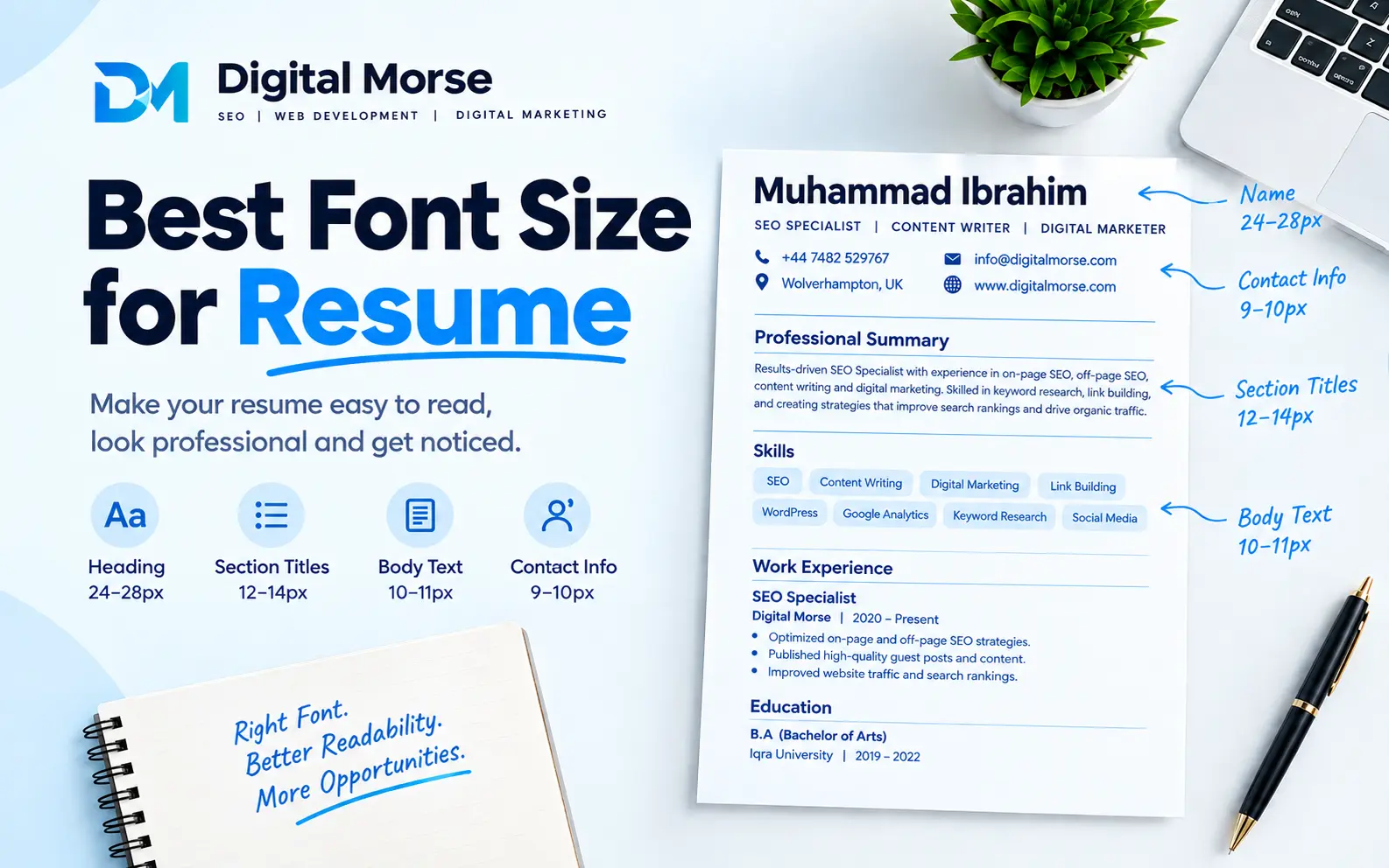
Use 11 pt for body text in Calibri or Arial, and stay within 10 to 12 pt depending on your typeface. Set section headings at 12 to 16 pt and your name at 18 to 24 pt. If your experience bullets won't fit at 10 pt, cut words instead of shrinking the text.
Why 11 pt Isn't the Same Size in Every Font
Point size measures the invisible box around a letter, not the letter itself. Fonts fill that box differently. The key measure is x-height, the height of lowercase letters like "e" and "a", which makes up most of the text on your page.
Garamond has a small x-height and narrow letters, so 11 pt Garamond reads like 10 pt Arial. Verdana is the opposite: wide and tall, so 11 pt can feel oversized and eat your page space.
Here are the starting points I use. Adjust them after the visual test in the next section.
| Typeface | Suggested body size | Why |
|---|---|---|
| Calibri | 11 pt | Compact but clear; 10.5 works if you need room |
| Arial / Helvetica | 10 to 10.5 pt | Wide, open letters read larger than the number suggests |
| Georgia | 10 to 11 pt | Large x-height for a serif |
| Cambria | 10.5 to 11 pt | Built for small sizes |
| Times New Roman | 11 to 12 pt | Narrow, so it needs the extra size |
| Garamond | 12 pt | Small on the page; 11 can look faint |
| Verdana / Tahoma | 9.5 to 10 pt | Wide and tall: going larger wastes space |
Half-point sizes like 10.5 are a legitimate tool. Word and Google Docs both accept them.
Build the Whole Size Ladder
Most people set the body and forget everything else. A resume reads better when each level is visibly different from the one below it, because the eye uses size to find its way.
- Your name: 18 to 24 pt, bold. Go larger only if the design has room for it.
- Section headings: 12 to 14 pt in bold or caps, or 14 to 16 pt in regular weight. Caps and bold look bigger, so they need less size.
- Job titles and company names: the same size as the body, set apart with bold or italics.
- Dates and locations: the same size as the body, or 0.5 pt smaller. Never use tiny gray dates; recruiters scan them to read your timeline.
- Contact line: body size or 0.5 pt smaller, as long as it stays easy to read.
- Bullets: match the body exactly. A smaller bullet size looks like fine print.
A useful check is that someone glancing at the page for a second should find your name, your last job, and your headings without reading anything.
The Two-Minute Test Before You Send
On-screen zoom lies to you. At 150% everything looks fine, and then the recruiter opens it at 100%.
- Set your viewer to 100% zoom and sit back at normal reading distance. Read one full bullet without leaning in.
- Print one copy on plain paper at 100% scale, not "fit to page". Hold it at arm's length.
- Squint at it. The headings and your name should still stand out as shapes, and the body should look like even gray blocks with clear gaps.
- Open the PDF on your phone. If you can't read a line without pinching to zoom, the text is too small or the margins are too tight.
If any step fails, go up by half a point rather than a full point.
How to Fit One Page Without Shrinking the Text
The usual advice is to cut words, but few guides say in what order to do it. This order protects readability the longest.
- Edit the content first. Delete weak bullets, merge duplicates, and remove jobs older than about 10 to 15 years unless they matter for the role. This usually recovers more space than anything else.
- Tighten line spacing to 1.0 to 1.1. Many templates default to 1.15 or higher.
- Reduce spacing between sections, not inside bullets. A few points of "space after" add up quickly.
- Trim margins to 0.7 inches. Below 0.5 inches the page looks cramped and some printers clip the edges.
- Drop the font by 0.5 pt, once. Stop at 10 pt for body text.
If you still don't fit at 10 pt with those changes, the content is the problem and a second page is better than 9 pt text. A clean two-page resume beats a crowded one-page resume, especially with several years of experience.
Where Your Font Size Quietly Changes
I've seen good resumes fall apart without the owner noticing. These are the usual causes.
- A4 vs US Letter. A4 is narrower and taller than Letter. If you build on one and the employer prints on the other, lines rewrap and your last bullet can slip onto a new page. Match the paper size to the country you're applying in.
- Missing fonts. If the reader's computer doesn't have your typeface, it swaps in another one with different widths. This is the main reason to export to PDF unless the employer asks for Word.
- Print scaling. "Fit to page" or "shrink oversized pages" can reduce your 11 pt text to the equivalent of 10 pt without telling you.
- Template defaults. Word's current default is Aptos, and many online builders start at sizes that don't match the ones above. Check the actual size on your body text, not the template's name.
Always export your final file, reopen it, and check the page count and line breaks before uploading.
Does Font Size Matter for ATS?
Most applicant tracking systems pull out the text in your file and don't care much about how big it is. A 10 pt resume and a 12 pt resume usually parse the same way, so size is mainly a human-readability decision.
There is one real risk on the small end. Tiny or white text used to stuff in keywords can be flagged by screening tools and looks bad if a person spots it. Don't use it.
Other formatting causes more parsing trouble than size does: text boxes, tables, columns, and headers or footers that hold important information. If you're worried, save the file as plain text and see what survives.
Adjust for Your Situation
The standard sizes cover most people, but a few cases call for changes.
- Recent graduates: you probably have room, so use 11 to 12 pt and keep the page airy.
- Senior professionals with two pages: hold 10.5 to 11 pt and use the extra page well. Don't shrink to force a single page.
- Academic CVs: longer documents are normal, so keep 11 to 12 pt and use clear heading hierarchy.
- Readers who skim on screens all day: recruiters may review hundreds of files. Larger text and white space make yours easier on the eyes.
- Applicants with visual impairments or who are applying to roles where accessibility matters: go to 12 pt and use a high-contrast, black-on-white style.
- Career changers: use size and bold to put transferable skills and results near the top where they're seen first.
Frequently Asked Question
Is 12 pt too big for a resume?
Not for body text. It suits narrow typefaces like Times New Roman and Garamond, but in a wide font like Arial or Verdana it can cost you a full page.Can I use 10.5 pt?
Yes. Half-point sizes work in Word and Google Docs, and they're a good way to gain a few lines without making text look small.What font size should I use in Canva or Google Docs?
Check the setting directly instead of trusting the template. Canva sizes can differ from Word's, so print or export to PDF and run the 100% zoom test.Should my cover letter use the same size as my resume?
Yes. Matching body size and typeface across both documents makes the application look like one package.What size works best if recruiters open my resume on a phone?
Stay at 10.5 pt or above and keep margins at 0.7 inches or more. Phone screens shrink the whole page, so very small text becomes unreadable.Can I make just the skills or contact section smaller?
Slightly, by 0.5 pt, if it stays legible. Don't shrink content that a recruiter needs to find quickly.