
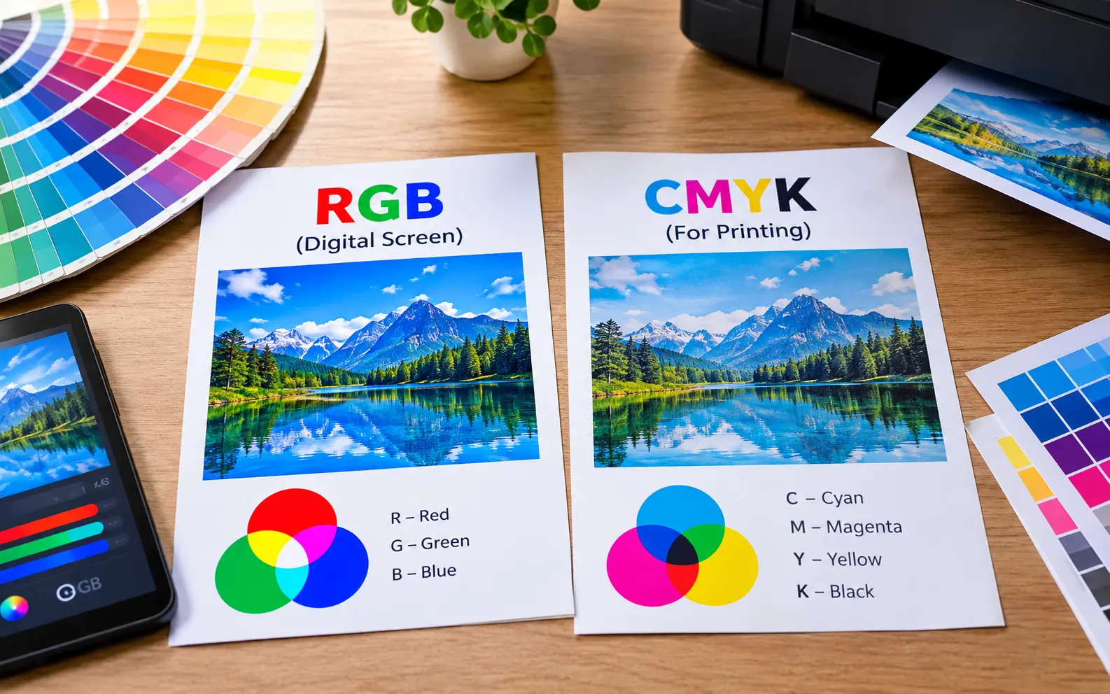
RGB is built for light-emitting screens and gives you a wider range of bright, saturated colors. CMYK is built for ink on paper and has a smaller color range, which is why some RGB colors, especially neons and electric blues, look duller once printed. For anything headed to a printing press, design or convert to CMYK before you submit your file, and always request a proof if color accuracy matters.
That's the short version. The longer version is where most guides stop short, and where the real headaches (and the real fixes) live.
Why your screen and your printer are having two different conversations
Here's the part most explainers skip: RGB and CMYK aren't just "two color modes." They're two completely different physical processes, and that's the actual root of every color problem you'll ever run into.
Your screen is a light source. It's throwing photons directly at your eyeballs, and layering red, green and blue light gets you closer to white the more you add.
Your printer isn't a light source. It's laying down pigment that has to reflect ambient light back at you, and every layer of ink it adds blocks more light rather than adding it. That's the entire reason a printed page can never look as luminous as a phone screen sitting next to it, no matter how good the printer is.
This isn't a flaw in printing technology. It's physics. A backlit pixel and a dye pigment are never going to behave the same way, so expecting an exact match between screen and paper is setting yourself up to be disappointed every time.
Why some RGB files actually print better than CMYK ones (the part nobody explains)
If you've ever searched this topic, you've probably found the same confused thread repeated across dozens of design forums: someone prints the same design once in RGB and once in CMYK, and the RGB version comes out more vibrant. People call it a fluke, a gnome, a glitch. It isn't.
Here's what's actually going on.
Old-school commercial offset presses use exactly four inks: cyan, magenta, yellow and black. If your file isn't in CMYK, the press has no choice but to convert it, and it uses a generic industry profile (often something called US Web Coated SWOP) to do that conversion. That profile is decades old and conservative by design, so it plays it safe with color.
Modern wide-format and digital inkjet printers are a different animal entirely. Machines like the ones used for stickers, banners, apparel and posters often run six, eight, even twelve ink channels, adding extras like photo cyan, photo magenta, orange, green or light black specifically to extend the gamut beyond what four inks can do. Their RIP software (the program that translates your file into instructions for the print head) is tuned to pull the most color out of an RGB file it possibly can, because RGB is the format most of its source material arrives in.
So when someone feeds the same printer an RGB file and a CMYK file, the RGB file can genuinely come out looking better, because the RIP has more room to work with and more ink channels to use. The CMYK file, meanwhile, has already been squeezed down to four colors before it even reaches the machine.
The practical takeaway: the "always convert to CMYK" rule is really a rule for offset and commercial press printing. For digital and wide-format printing (most sticker shops, poster printers and print-on-demand services), check what your specific printer recommends first. Plenty of them, including Printful, actually ask for sRGB files and handle the conversion on their end with a profile tuned to their exact machines.
When CMYK is genuinely the right call
None of that means CMYK is outdated. It means CMYK is the correct tool for a specific job, and that job is any print process where ink coverage, plates or press calibration are involved.
Design or convert to CMYK when you're working on:
- Offset-printed materials, like large-run business cards, brochures, magazines or packaging
- Anything going to a commercial print shop that explicitly asks for a "press-ready PDF"
- Projects with brand colors that must be exact, since CMYK percentages give you a fixed, repeatable recipe rather than a screen-dependent guess
- Text-heavy layouts, because working in CMYK from the start avoids last-minute surprises with small type turning slightly blurry from a rich black conversion
If you're not sure which category your project falls into, ask the print vendor directly. A five-second email saves you from reprinting five hundred flyers.
| What you're deciding | RGB | CMYK |
|---|---|---|
| Color source | Emitted light | Reflected ink |
| Best for | Screens, apps, social media, video | Offset presses, packaging, brand-critical print |
| Color range | Wider, includes neons and electric tones | Narrower, no true neon |
| Risk if used wrong | Colors look washed out on screen (rare) | Colors shift, print jobs get rejected by the press |
| Who converts it | You, before final export | Sometimes the printer's RIP, sometimes you |
| Ask your printer? | Not usually necessary | Always worth confirming |
The specific colors that break first
Not all colors are equally at risk when they move from screen to paper. Some shift so predictably that experienced designers can spot the danger zones before they even open a proof.
- Neon and fluorescent tones rely on light intensity that ink physically cannot replicate, so they always lose punch.
- Electric or saturated blues frequently drift toward purple in print, because CMYK needs a heavier dose of magenta to get that deep blue, and a slightly heavy hand on magenta tips the whole thing purple.
- Bright teals and turquoise often go muddier or greener than expected, since this hue sits right at the edge of the CMYK gamut.
- Vivid purples and violets tend to lose their glow and read as more muted or grayish.
- Lime and highlighter greens flatten out considerably, landing closer to a standard grass green.
If your design leans on any of these, don't wait for the final print to find out. Pull up your file's CMYK values (or your design software's gamut warning tool, found in Photoshop under View) before you hit send, and nudge anything flagged as out of range toward a slightly less extreme version of itself.
ICC profiles and rendering intent: the setting almost nobody mentions
Every guide talks about converting RGB to CMYK. Almost none of them mention that how you convert matters just as much as whether you convert.
When software translates a color from RGB to CMYK, it uses an ICC profile (a data file describing exactly how a specific device or standard reproduces color) plus a setting called rendering intent, which decides what happens to colors that fall outside the target gamut.
Two rendering intents matter for print work:
- Perceptual shifts the entire color range proportionally, so relationships between colors stay smooth. This works well for photos and gradients, where a slightly-off color is less noticeable than a harsh jump between shades.
- Relative colorimetric keeps in-gamut colors exact and only remaps the ones that don't fit. This works better for logos and flat brand colors, where you need specific colors to stay as close to their original values as possible, even if it means less smooth transitions elsewhere.
Most software defaults to perceptual, which is fine for photography but can quietly shift your carefully chosen brand blue. If a client's exact brand color matters, switch the rendering intent to relative colorimetric before converting, then check the result against your brand guide.
Spot color: the option most comparisons leave out entirely
RGB and CMYK aren't the only two paths into print. There's a third option, and it solves the exact problem this whole topic is about: color inconsistency.
Spot colors, usually referring to the Pantone Matching System (PMS), are premixed inks applied as a single, solid layer rather than being built from a combination of four process colors. Because the ink itself is a fixed formula, a Pantone 186 red looks like Pantone 186 red whether it's printed today in Karachi or next year in Chicago, on a different press entirely.
This matters most for:
- Logos and brand marks, where color consistency across every touchpoint is non-negotiable
- Low-color designs, like a two-color letterhead, where spot printing can actually cost less than four-color process
- Colors that CMYK genuinely can't reproduce well, including many metallics, neons and deep, saturated corporate colors
The tradeoff: spot color isn't practical for full-color photography or complex gradients, and it typically costs more per color for short runs. But if your entire print budget hinges on one brand color looking exactly right, it's worth asking your printer if a spot color run is available before you resign yourself to a CMYK approximation.
How the paper itself changes your printed color
Even a perfect CMYK conversion can come out looking different than you expected, and paper stock is usually the reason why.
- Coated (glossy or satin) stock reflects more light back at the viewer, so colors read brighter and contrast reads sharper.
- Uncoated stock absorbs more ink into the paper fibers, which softens colors and slightly dulls saturation, especially in solid color blocks.
- Bright white paper makes colors pop more accurately, while a natural, cream, or recycled kraft stock adds a warm cast that shifts everything, including your blacks and blues, toward the warmer end.
If a client has approved a color on a glossy proof, don't assume the same file will look identical on a matte or uncoated reprint. Ask for a fresh hard proof on the actual stock you're using for the final run. This one habit alone prevents more disputes than any color theory explanation.
A practical pre-flight checklist before you hit print
Run through this before submitting any print file, especially for a job where color accuracy actually matters:
- Confirm the print process with your vendor. Offset press or digital/wide-format printer? This single answer decides whether CMYK conversion should happen on your end or theirs.
- Check your color mode in the document settings, not just the individual swatches, since some programs let colors and documents drift out of sync.
- Scan for out-of-gamut warnings on any neon, electric blue, teal or lime green elements.
- Decide your rendering intent based on whether the file is photo-heavy or brand-color-heavy.
- Request a hard proof (a physical test print) for anything with exact brand colors, large solid areas, or a run size that makes a reprint expensive.
- Specify your black formula. Use 100% K alone for small text and fine lines so edges stay crisp, and a rich black mix (a common starting point is roughly 60% C, 40% M, 40% Y, 100% K) for large solid dark areas so they don't read as a washed-out charcoal.
- Match your file to the actual paper stock you're ordering, not a generic default.
Fixing colors that already shifted
If you've already got a print back and the color's wrong, here's how to diagnose it fast rather than guessing.
Blue printed as purple: Your CMYK mix likely leans too heavy on magenta relative to cyan. Open the file, find the blue's CMYK breakdown, and nudge magenta down a few points while keeping cyan steady.
Everything looks flat and lifeless: This usually means the file was converted using a generic default profile rather than one matched to the actual printer and paper. Ask your print vendor which ICC profile they use and convert your file with that specific profile instead of your software's default.
Blacks look gray or washed out: You're almost certainly using 100% K alone on a large area. Switch to a rich black formula for anything bigger than body text.
Colors were fine on the digital proof but wrong on the physical print: Digital, on-screen "soft proofs" simulate CMYK using your monitor's backlight, which is still light-based. They're a useful sanity check, but they cannot fully predict how ink sits on physical paper. For anything with tight color requirements, a physical hard proof is the only way to be certain before a full run goes to press.
Frequently Asked Question
Does it matter which software I use to convert RGB to CMYK?
Yes. Photoshop, Illustrator and online converters can each apply slightly different default ICC profiles, which means the exact same RGB file can convert to slightly different CMYK values depending on the tool. If color precision matters, standardize on one tool and one profile for the whole project rather than converting pieces in different programs.
Why does my printed color look different from my phone versus my laptop, even before it's printed?
Because RGB itself isn't one fixed standard. Different screens use different color spaces (sRGB is the most common baseline, while many newer phones and monitors use the wider Display P3 gamut), so the same RGB values render slightly differently depending on the display. This is a separate issue from RGB-to-CMYK conversion, and it's why a design can look inconsistent even before ink gets involved.
Can I ask a print shop to match a color from a photo I took on my phone?
Not reliably. Phone cameras apply their own color processing and white balance adjustments, which means the color in the photo file is already an interpretation, not a measurement. If a specific color match matters, use a physical swatch, a Pantone reference, or exact CMYK/hex values instead of a photograph.
Is it ever okay to skip converting to CMYK and just let the printer handle it?
For many digital and wide-format print shops, yes, and some actively prefer it. The safest move is to check your specific printer's file guidelines rather than assuming one rule applies everywhere.
Why do two prints of the same file from the same printer look slightly different?
Ink levels, humidity, paper batch variation and even how long a printer has been running since its last calibration can all cause small color drift over time. For color-critical, long print runs, ask your vendor about their color consistency checks or request spot checks partway through a large order.
What's the fastest way to check if a specific color will survive the print process?
Turn on your design software's gamut warning tool (Photoshop: View > Gamut Warning) while working in RGB. It highlights any color that falls outside the CMYK range in real time, so you can adjust before you've built an entire layout around a color that was never going to print accurately.
Do I need different files for different printed products, like a sticker versus a business card?
Potentially, yes, especially if they're being produced on different types of equipment. A sticker made on a wide-format digital printer and a business card made on an offset press may call for different color modes or profiles, even if they're using the exact same brand colors. Check with each vendor separately rather than assuming one master file works everywhere.
Why does my design look correct in the PDF preview but wrong once it's actually printed?
PDF previews are usually rendered using your screen's RGB display, even when the underlying file is tagged as CMYK, so the preview is still an approximation. The only fully reliable check is a physical hard proof on the actual paper stock and printer that will produce your final run.